If you want to know more about the Baskin Robbins Logo, you are in the right place. This article will teach you about the logo’s history, meaning, and how it’s used to create a strong brand identity.
Whether you’re a big fan of Baskin Robbins or you’re just curious about the brand, I hope you find this article helpful.
Why is the Baskin Robbins logo important?
The Baskin Robbins logo is important for a number of reasons. First, it is a symbol of fun, joy, and delicious ice cream. The logo is instantly recognizable to people all over the world, and it evokes a sense of nostalgia and happiness.
Second, the logo is used to create a consistent and recognizable brand identity for Baskin Robbins. It helps to ensure that consumers can easily identify Baskin Robbins products and services.
Third, the logo is used to promote Baskin Robbins’ brand values. The logo conveys a sense of fun, creativity, and quality. It also communicates the message that Baskin Robbins offers a wide variety of ice cream flavors to choose from.
The History of the Baskin Robbins Logo
When Burt Baskin opened his Burton’s Ice Cream Shop in Glendale, California in 1945, the history of Baskin-Robbins began.
Another ice cream parlor was founded by Irv Robbins in Pasadena, a year after his brother-in-law started one. Joining forces, the brothers-in-law waited two more years. Under their own brands, each of them worked closely together for several years.
1947: The Baskin Robbins logo looked very old-fashioned. When it was redesigned over 40 years later, it was a big improvement. The 1991 logo used a friendly font and a different shade of blue instead of brown.
The number 31 was also redesigned. It was a good logo. It didn’t look as old as some logos from the 1990s, but I understand why the company wanted to change it again in 2006. They wanted it to look more fun.

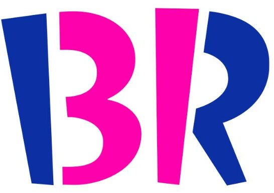
2006: The Baskin Robbins logo is a great design. The number 31 is cleverly embedded within the letters B and R. This is taught in design books.
The 2006 logo is a big improvement from the 1991 version. The font is a bit childish, but that was the point. It has personality, it is simple, unique, memorable, and fun. I don’t think it needs to be redesigned again, but it is not up to me to decide.

2022: The Baskin Robbins logo is redesigned again. The new design is more modern and streamlined, but it still retains the basic elements of the “BR” abbreviation, the number “31”, and the pink and brown color scheme.
The Baskin Robbins logo has changed over the years, but it has always retained its basic elements. The logo is a symbol of fun, joy, and delicious ice cream.
The Meaning of the Baskin Robbins Logo
The Baskin Robbins logo is more than just a pretty face. It has a deep meaning that is rooted in the brand’s commitment to variety and fun.
- A Commitment to Variety: In the Baskin Robbins logo, 31 represents a spectrum of flavors. In the world, one of the largest selections of ice cream flavors is known as Baskin Robbins.
- A Focus on Fun and Flavor: The logo of Baskin Robbins is also a representation of fun and taste. And excitement and anticipation, the playful design with bright pink and brown invites.
Description of the logo’s elements
The Baskin Robbins logo is a simple but effective design that is instantly recognizable to people all over the world. It is a symbol of fun, joy, and delicious ice cream.
- Color scheme: The Baskin Robbins logo has a pink and brown color scheme. Pink is often associated with femininity, sweetness, and love, while brown is associated with masculinity, strength, and reliability. Together, these colors create a sense of balance and harmony.
- Typography: The logo uses a bold, sans-serif font that is easy to read, even from a distance. This makes the logo stand out and be easily recognizable.
- Imagery: The “BR” abbreviation is stylized to form the number “31”, which represents the variety of Baskin Robbins flavors, one for each day of the month. This is a clever and memorable way to communicate the brand’s unique selling proposition.
- Hidden message: The Baskin Robbins logo also contains a hidden message. The pink parts of the letters “B” and “R” form the number “31.” This is a clever way to incorporate the brand’s signature selling point into the logo design.
Conclusion
The Baskin Robbins logo is a simple design that has made people happy for many years. It is easy to know and makes people think of happy times from the past. The logo can be used in many different ways, such as on signs and ice cream cups.
Thank you for reading about the Baskin Robbins logo! I hope you learned something new. I hope you have a great day filled with joy and happiness!
FAQs
What is the meaning of the Baskin Robbins logo?
The Baskin Robbins logo has several different meanings. The word “31” represents the 31 flavors of ice cream that Baskin Robbins is known for. The pink color of the logo is often associated with happiness and joy, which is what Baskin Robbins hopes to bring to its customers.
Who designed the Baskin Robbins logo?
The Baskin Robbins logo was designed by Saul Bass in 1953. Bass was a renowned graphic designer who is also known for designing the logos for AT&T, United Airlines, and American Airlines.
What are some of the different ways that the Baskin Robbins logo has been used?
The Baskin Robbins logo has been used in a variety of different ways over the years. It can be seen on store signage, ice cream cups, packaging, and advertising materials. The logo has also been used in popular culture, such as in the movie “Pulp Fiction” and the TV show “The Simpsons.”
What do you think the Baskin Robbins logo says about the company?
I think the logo says that Baskin Robbins is a fun and happy company that’s all about bringing joy to its customers.